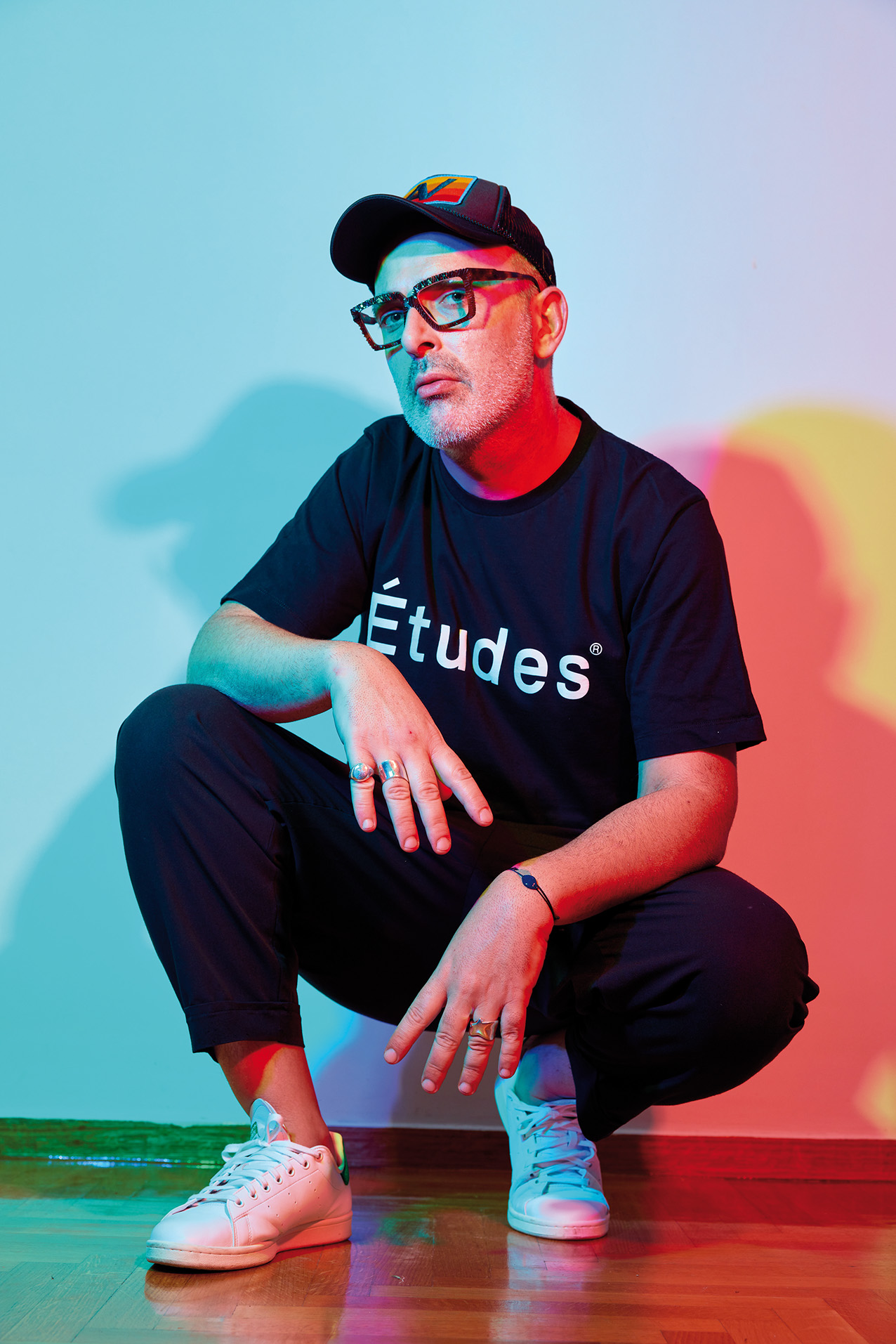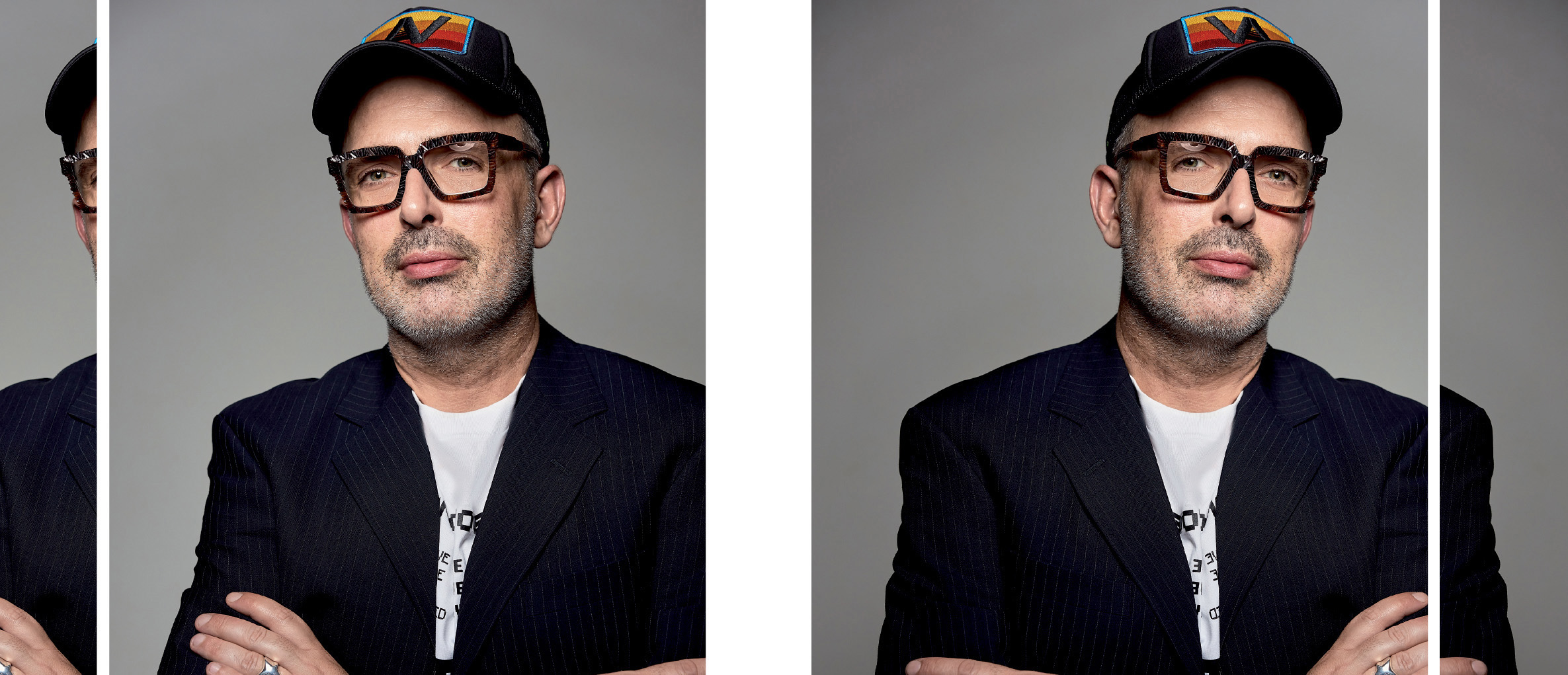
George Pytharoulis, Creative Director in Communication Design, delves in the visual identity potential of Athens Riviera, blending the past and the future.
From an early age, George Pytharoulis loved design, fashion, photography, and anything related to aesthetics, his natural inclination towards the visual arts shining through. He formalized this love by studying graphic design in both Athens, Greece, and London. His relationship with images is very unique. Everyday things act as stimuli to his mind to create new worlds and a new perception of reality. His love of music entered this creative mix. His sources of inspiration include walks along the center of Athens, interesting architecture, imaginative outfits, classic movies by the likes of Hitchcock, and suspense books. On Sundays, you’ll find him wandering the streets with his Polaroid camera in hand or drawing and exploring new designs and techniques.
With your experience as a designer and concerning the creation of corporate identity, what are the strongest elements you would display if you were branding Greece, our country?
Light as a source of energy, inspiration, and hope that connects the present, past, and future—a widespread light—this is what I think describes Greece. It’s a light that comes from our history, our civilization, and the people of this land, where, I’d like to believe, kindness, generosity, and humanity still prevail. Cultural, historical, and societal values that hold from generation to generation and evolve through new perspectives and stimuli. Greece’s strength is singular, even though it hasn’t revealed itself in full yet. The elements I’d use to compose Greece’s visual identity would highlight the characteristics above while creating a dialogue between modern and classic forms.
Also, the color blue that dominates our clear skies and vast seas, and the intense geometric motifs of our architecture, would complement this identity’s canvas. Symbols and designs that convey messages both clear and allegorical. I really believe in the dynamics of productive contradictions. And our Greece can support this with courage and virtue.
Can an effective logo overshadow its product? If so, in what cases?
A product’s logo and visual identity are essential parts of its final image. The principles of visual identity must project the values, philosophy, and unique characteristics of any product in a clear, meaningful, and aesthetically perfect way. All our senses are equally important. Visual stimulation and the emotions or thoughts a product can inspire are some of the goals of visual identity, which factor into our decision-making. The abundance of products out there generates bigger demands when it comes to how branding should be tackled. Now more than ever, designing a product’s visual identity doesn’t just depend on pretty colors and superficial approaches. The precision, meaningful study, knowledge, research, talent, and passion of the person designing the identity combined with the respect for the environment, society, and the brand itself are elements that will define and determine the value and superior aesthetics of the said brand.
With the above in mind, yes, I believe that a product’s visual identity is an important factor to choose it. I also believe that today’s consumers know very well how to judge a product’s true worth. So, if it has no winning qualities, the branding alone can’t maintain long-term interest in the product.
It’s important that brands choose people and partners with common beliefs, values, philosophies, and concepts regarding aesthetics.
What international campaigns in visual identity or logo design have intrigued you?
Apple, in my opinion, is a great point of reference in terms of design and communication. Its ability to speak through ad campaigns and branding in a consistent, simple, and at the same time confident way emits powerful feelings. This brand’s ingenuity lies in the fact that it adds depth with attention to detail, quality, and technical features, but without its final result and medium of communication confusing its audience. Instead, it creates positive feelings, modernity, uniqueness, and technological superiority. Since its inception, the logo has kept the apple’s simple lines, conveying messages of innovation, creativity, and a sense of constant exploration and restlessness. This particular brand is a case study, and I personally identify with its philosophy and the aesthetics it represents.
Nike’s branding is another example of intelligent image design and strategy. The logo’s simple lines link up with the brand’s values, exuding strength, timelessness, and a sense of encouragement. “Just do it.” At the same time, Nike’s campaigns don’t focus on the product but create the conditions, build the emotions that will ultimately lead the consumer to the product.
Is there a secret to creating a visual identity that sets high aesthetic standards and works as a distinguishing feature?
The secret is the perception, sensitivity, and creativity within each designer. The distinguishing feature is a difference in perception, sensitivity, and creativity. Different people. Different concepts. It’s important, in my opinion, that brands choose people and partners with common beliefs, values, philosophies, and concepts regarding aesthetics. We’re all different, but within our diversity, there are people who share a common passion. Through shared passions, miracles are created, some smaller, some greater.
What would you add to the Athens Riviera brand if you oversaw the creation of a new narrative or a fresh visual identity?
As I already mentioned, creating a visual identity takes research and precision, as well as emotion and imagination. The first thought that comes to mind about Athens Riviera, and drawing from my own feelings, which take me back several years, is a combination of seasons.
I’d describe it as watching Athens Riviera through a pair of glasses with one retro and one kaleidoscopic lens. Retro makes me smile. It brings me memories and black-and-white films set on the beachfront with vintage swimsuits and a sweet breeze rustling the scarf on the neck. It takes me back to when my emotions ran high to crazy dance rhythms and 90s music hits.
The kaleidoscopic lens symbolizes the different choices of today. Beautiful hotels, as well as constantly evolving venues and bars with haute cuisine. Authenticity hides in contradictions. We respect the past and welcome the future. We hold onto memories and create new ones.
Does the area need place branding? And conversely, what area of Athens, including the beachfront from Piraeus to Sounion, would need place branding?
Generally speaking, we all need branding. What matters in visualizing the dynamic identity of a product, a region, or even a person is to know what characterizes that which we want to project. What we have inside will come out. It’s all connected. The same applies to creating an identity. If it’s to be effective, digestible, and agreeable, it must inspire emotions. To create such emotions, it must contain truth. For there to be truth, we must know who we are, what we want, and where we want to go, and we must adhere to these values with consistency and purity.